The Governors Ball
Graphic Design
Overview
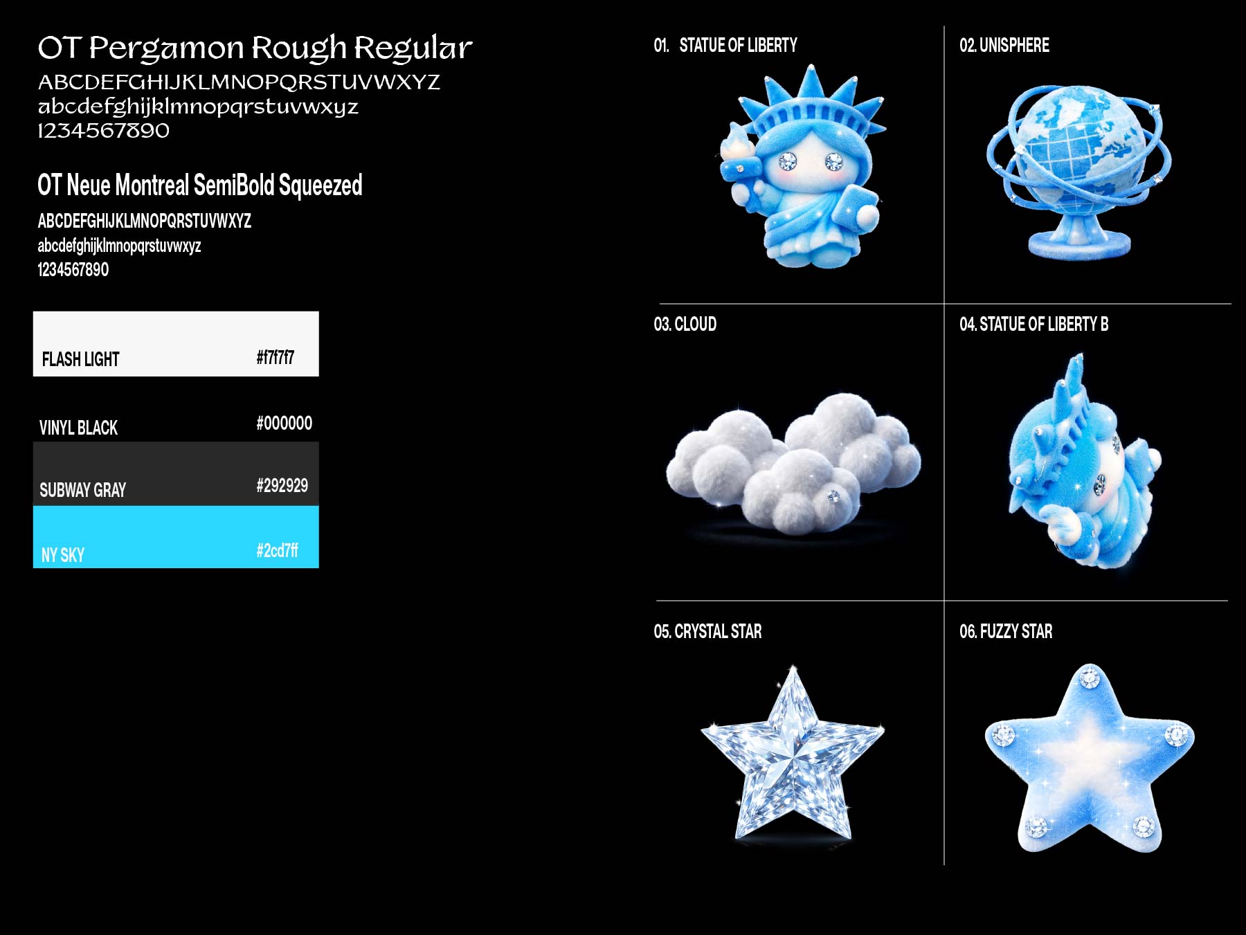
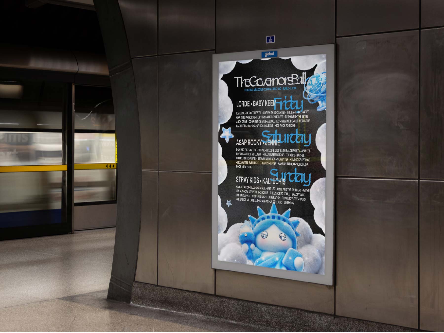
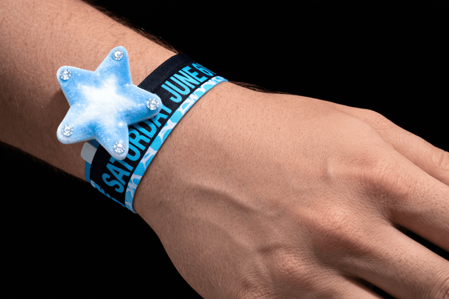
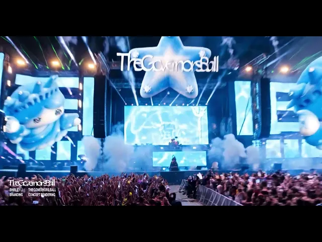
The Governors Ball branding project reimagines the festival’s identity through the lens of summer atmosphere, using a cool blue color palette to visually counteract the heat of the season and create a sense of freshness and relief. Blue functions not just as a color choice but as an emotional and sensory experience, evoking calmness within the high-energy environment of a music festival. Paired with this, soft, rounded 3D forms are used as core visual assets to express bubbiness, playfulness, and joy, reflecting the cheerful and communal spirit of the event. The inflated, tactile quality of these forms adds a sense of lightness and approachability, transforming the brand into an immersive, feel-good experience that balances intensity with ease.